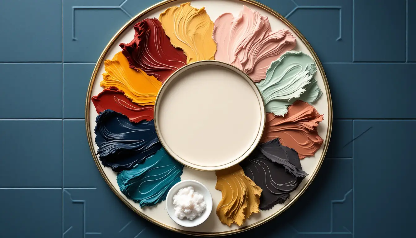
The Psychology Behind Website Color Choices and Conversions
The internet is a battleground for attention, and your website’s colors fight for you. They are more than just a pretty face — they’re a silent force shaping how visitors feel, act, and decide. A well-chosen hue can nudge someone to click “Buy Now” or linger longer, while a misstep can send them clicking away. Understanding color psychology in web design and using the best website color schemes can unlock higher conversion rates, turning casual browsers into loyal customers. Let’s explore how colors influence user behavior, align with your brand, and drive actions, with practical tips to optimize your website’s performance.
Jump to a Section

The Power of Color Psychology
Colors on your website do more than catch the eye — they tap into human emotions and shape how visitors interact with your business. Understanding why colors matter and how they trigger feelings can help you create a site that draws people in and keeps them engaged. The impact of colors on user behavior online is profound, as hues can evoke specific emotions that influence decisions and actions.
Why Color Psychology Matters in Web Design
Color psychology is the study of how hues affect human emotions and decisions. On a website, colors do more than decorate — they communicate. A fiery red button might scream urgency, pushing a visitor to act fast, while a soothing blue background can make them feel safe enough to share their email.
These reactions aren’t random; they’re wired into how our brains process visuals. Strategic website color choices for higher conversions can guide visitors toward actions like signing up, purchasing, or filling out a form, directly boosting conversions. Get it wrong, and you risk confusing or alienating your audience. By tapping into color psychology, you can create a website that feels intuitive and persuasive, encouraging users to take the next step.
How Colors Shape Emotions and Associations
Every color carries an emotional charge.
-
Red sparks excitement or urgency, making it a go-to for clearance sales or countdown timers, but too much can feel aggressive.
-
Blue, a staple for banks and tech firms, radiates trust and calm, inviting users to stick around.
-
Green evokes nature and growth, ideal for eco-conscious brands or wellness sites.
-
Yellow grabs attention with its sunny vibe but can tire eyes if overused.
-
Purple, linked to creativity and luxury, suits artistic or high-end businesses.
These associations vary by culture, though. In Western contexts, white signals purity, but in parts of Asia, it’s tied to loss. Misjudge your audience’s cultural lens, and your colors could send the wrong message. Aligning hues with your visitors’ emotional and cultural expectations creates a welcoming vibe, increasing the odds they’ll convert.

Colors as Brand and Trust Builders
Your website’s colors help to introduce your brand and build trust with visitors. By choosing brand colors for websites that reflect your business’s identity and resonate with your audience, you can create a sense of reliability that encourages users to take action.
Building Trust Through Color and Branding
Your brand’s colors signal who you are and whether visitors can trust you. Consistent colors across your website, logo, and marketing build familiarity, making your business instantly recognizable.
Trust is the foundation of conversions — if users feel uneasy, they won’t share personal details or make a purchase. Thoughtful color choices reinforce your brand’s identity and reliability.
-
Take PayPal, which uses blue to project security, reassuring users it’s safe to transact.
-
Coca-Cola’s bold red and white palette carries its lively, familiar energy online, strengthening brand loyalty.
-
Apple’s minimalist white and gray tones scream sophistication, convincing users its products are worth the price.
These examples show how colors, when aligned with brand values, build trust and encourage actions like sign-ups or sales. Choose hues that reflect your business’s personality to create a seamless, trustworthy experience.
Targeting Your Audience with Color Choices
Not everyone sees colors the same way. Age, gender, and culture shape how people respond. Younger users might love bold, vibrant hues like neon pink or electric blue, while older audiences often prefer muted tones like navy or beige. Gender can influence preferences too — research suggests women may lean toward softer shades like pastels, while men gravitate to stronger colors like black or red. Cultural differences add complexity. Red symbolizes luck in China but can mean danger in Western contexts. If your website serves a global audience, research your users’ backgrounds to avoid missteps. For example, a site targeting Gen Z might use trendy, high-energy colors, while one for retirees might stick to calming, traditional hues. Tailoring colors to your demographic makes your site feel like home, boosting engagement and conversions.
Designing for Usability and Action
A website that’s easy to navigate and prompts action is a website that converts. Colors play a huge role in making your site user-friendly and guiding visitors toward key actions, like clicking a button or filling out a form. Let’s find out how to use color to enhance usability and drive the results you want.
Enhancing User Experience with Color
User experience (UX) is about making your website easy and enjoyable to navigate, and colors are a cornerstone of that. They affect readability, guide attention, and shape how users flow through your site. High-contrast combinations, like black text on a white background, ensure text is legible, keeping visitors from squinting or bouncing. Poor choices, like light gray text on white, frustrate users and hurt engagement. Colors also signal where to click — a bright button in a contrasting hue stands out as interactive.
Good color combinations for websites prioritize accessibility, ensuring everyone, including those with visual impairments, can navigate with ease. For instance, blue links on a white background are a timeless, user-friendly choice. A color-driven UX keeps visitors on your site longer, and leads them to complete a desired action.
Guiding Actions with Strategic Color Placement
Colors are a subtle but effective way to steer user behavior. A well-placed pop of color can draw eyes to a call-to-action (CTA) button, like “Add to Cart” or “Get Started.” Contrasting hues work best — a red button on a white page demands attention. This approach, rooted in visual hierarchy, guides users toward key actions without overwhelming them.
Top website color schemes often pair neutral backgrounds with bold accents to highlight buttons or promotions. For example, a soft gray site with orange CTAs funnels attention to the checkout process. By directing focus, colors smooth the path to conversion, making it effortless for users to take the next step, whether it’s subscribing or buying.
Mastering Color Harmony and Impact
Choosing the right colors isn’t just about picking what looks good — it’s about creating a balanced, impactful design that resonates with users. From harmonious color schemes to real-world success stories, let’s dive into how to craft a visually appealing website that maximizes conversions through strategic color use.
Crafting Effective Color Combinations
Choosing colors that work together is both an art and a science. The best color combinations for websites balance harmony and contrast to create a visually appealing experience.
Complementary colors, like blue and orange, bring vibrant energy but can clash if overdone.
Analogous colors, like blue and green, feel cohesive and calming, perfect for professional sites.
Monochromatic schemes, using shades of one color, look sleek but risk monotony.
Contrast is critical for accessibility — high contrast between text and background ensures readability, while low contrast can alienate users, including those with colorblindness. For example, pairing dark blue text with a light yellow background is both striking and accessible.
Avoid common pitfalls, like red-green combinations that confuse colorblind users, to keep your site inclusive and conversion-friendly.

Tools for Choosing Winning Color Schemes
Picking the right colors for your website can feel overwhelming, but you don’t have to do it alone. There are plenty of tools that can help you find the best website color schemes that look great and drive conversions, even if you’re not a design expert. These services offer pre-built palettes, color wheels, and accessibility checks to simplify the process.
Here are several tools to create good color combinations for websites:
-
Coolors. A tool for generating color palettes with options to adjust, lock, and export colors for use in your design projects.
-
Adobe Color. A color wheel-based tool for creating schemes using complementary or analogous hues, with features to check accessibility.
-
Canva Color Palette Generator. Allows you to upload an image or logo to generate a matching color palette for your website.
-
WebAIM Contrast Checker. Evaluates text and background color combinations to ensure they meet accessibility standards for readability.
-
Contrast Ratio. Checks the contrast between two colors by entering their codes, verifying compliance with accessibility guidelines.
-
Color Hunt: Offers a collection of pre-made color palettes created by designers, available for browsing and use.
-
Paletton. Provides a color wheel and templates to create and preview color schemes in sample layouts.
Case Studies: Color Strategies That Work
Real-world examples reveal the power of color in driving conversions. In e-commerce, Amazon’s clean white background with orange “Add to Cart” buttons minimizes distractions, guiding users to purchase with ease. Shopify’s green accents evoke growth and creativity, aligning with its mission to empower entrepreneurs, while its clear layout encourages sign-ups.
Beyond online, offline retail offers valuable lessons. Supermarkets like Walmart use bright red and yellow signage to create urgency, nudging shoppers to grab deals quickly. Luxury stores like Tiffany & Co. opt for soft blues and whites, creating a serene atmosphere that invites customers to linger and savor the experience. Starbucks’ warm greens and browns make its cafes feel cozy, encouraging patrons to stay longer and spend more.
These strategies translate online — fast-paced e-commerce sites use bold colors to drive quick actions, while premium brands lean on subdued tones to build emotional connections, both lifting conversions.
Refining and Avoiding Color Mistakes
Even the best color ideas need testing and tweaking to shine. Mistakes can turn visitors away, but smart testing can keep your website on track.
Color missteps can derail your website’s success:
-
Using too many hues overwhelms visitors, diluting your brand and creating visual chaos.
-
Clashing colors, like neon pink and lime green, look unprofessional and push users away.
-
Ignoring accessibility is a major error — low-contrast text or colorblind-unfriendly palettes exclude users, hurting engagement.
-
Choosing colors that clash with your brand’s vibe, like bright yellow for a law firm, undermines trust.
Feel free to experiment and test to refine your color choices. A/B testing lets you compare two versions of a page — one with a green button, another with a blue one — to see which gets more clicks. Heatmaps reveal where users look and click, showing if your colors are guiding attention effectively. Tools like Google Optimize will help you. Start small: test a CTA button color or background shade, then check the data. If a yellow button outperforms red, roll it out across your site. Regular testing keeps your colors aligned with user behavior.
Colors are a quiet but powerful force in your website’s success. By understanding how hues shape emotions, build trust, and guide actions, you can create a site that feels intuitive, welcoming, and persuasive. Whether you’re running an online store or a service-based business, thoughtful color choices can turn visitors into customers. Experiment with the best color palettes for websites, test relentlessly, and refine based on what your audience loves. With the right colors, your website won’t just look good — it’ll work harder for your business.


